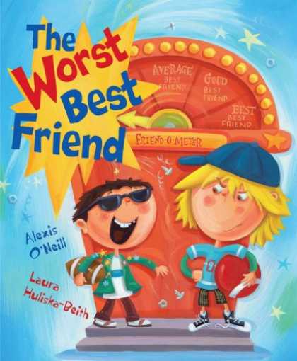
The Worst Best Friend by Alexis O'Neill and illustrated by Laura Huliska-Beith is a book that shows what true friendship means. It is a book I think children would really benefit from reading because I feel almost all children could relate to the message that is being presented. Friends want what is best for each other, they treat each other kindly even if they may be angry, and friends sometimes make mistakes.
Mike and Conrad are best-best friends. They do everything together, and they even have a special handshake. This all changes when a new boy named Victor joins the classroom. Conrad thinks Victor is great! He seems to completely forget about his best-best friend Mike. Mike becomes pretty upset and feels left out since Victor and Conrad now seem to be best friends. When a game of kickball is about to start (Mike and Victor are captains), something makes Mike realize he should be a good friend to Conrad even though he is upset. Victor tells Conrad he is too small for his team and that he wants him team to win. Therefore, he refuses to pick him. Mike feels sorry for his ex-best-best friend and decides to choose him for his team. In the end, Mike's team loses. However, Mike and Conrad learn a valuable lesson. Best-best friends should always treat each other nicely and be there for one another. Conrad apologizes to Mike, and they are able to do their handshake and return to being best-best friends.
I can totally see me reading this book to my future students. It sends a good message while being very realistic. Many children face a situation like Mike and Conrad were in. I really like how the author chose to portray their relationship with each other and how it changed when Victor entered the dynamics.
The illustrations in this book remind me of the cartoon "Jimmy Neutron". They are cartoon-like with a realistic look. The colors were all bright and seemed to jump off the page. The text was another really great aspect. The size, color, and font varied from page to page. It helped show what words to emphasize, and I think this can really help children while they read. Also, the way the text was presented was occasionally set-up differently as well (vertical, slanted, etc).
I would suggest this book to others. It is entertaining and presents a positive message to readers.
No comments:
Post a Comment